User guide
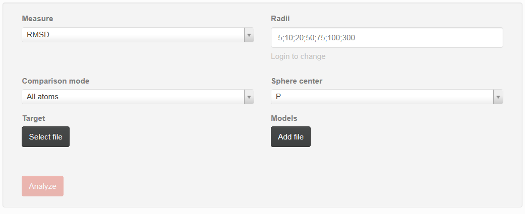
Fig. 1. Screenshot of the User guide
User guide can be used to set up parameters that can be used during analysis (Fig. 1).
- Measure
- user can choose metrics that will be used for detailed analysis. One can choose between RMSD – root mean square deviation, Deformation Index, Adjusted RMSD (taking into consideration penalty if some atoms are missing), Interactions Network Fidelity All, Interactions Network Fidelity Watson-Crick, Interactions Network Fidelity non-WatsonCrick, Interactions Network Fidelity Stacking
- Radii
- correspond to vector of sphere radii that user wants to be analyzed. Each radius should be separated by semicolon
- Comparison mode
-
user can choose between “all atoms” or “single atom” option:
- Single atom - from the whole molecule only correctness of selected type of atoms will be analyzed for reference structure and models
- All atoms - all atoms will be considered during evaluation of models quality against reference structure
- Sphere center
- user can choose atom that corresponds to the center of sphere that has been built on each nucleotide. One can choose between P, C1’, O5’, O3’
- Target
- selection of the reference structure
- Models
- selection of set of models that will be analyzed against reference structure
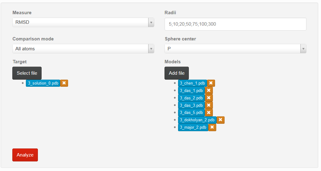
Fig. 2. Screenshot of the User guide with chosen models and reference structure
If all parameters are correctly set, one can choose “Analyze” button to proceed with analysis (Fig. 2).
If user want to delete previously chosen structure, mark “x” situated on the right side of the particular model should be chosen.
By clicking on the name of model, user can obtain visualization of the particular structure.
Result of the analysis
Results section consists of three parts:
- Global quality analysis
- Linear plots
- 2D and 3D graph
Each graph can be enlarged by simply clicking on it.
Ad a) Global quality analysis
That section is available if all metrics are calculated for the whole molecule. At the beginning one find only red bar, but after calculation one can see statistics for analyzed models (Fig. 3)
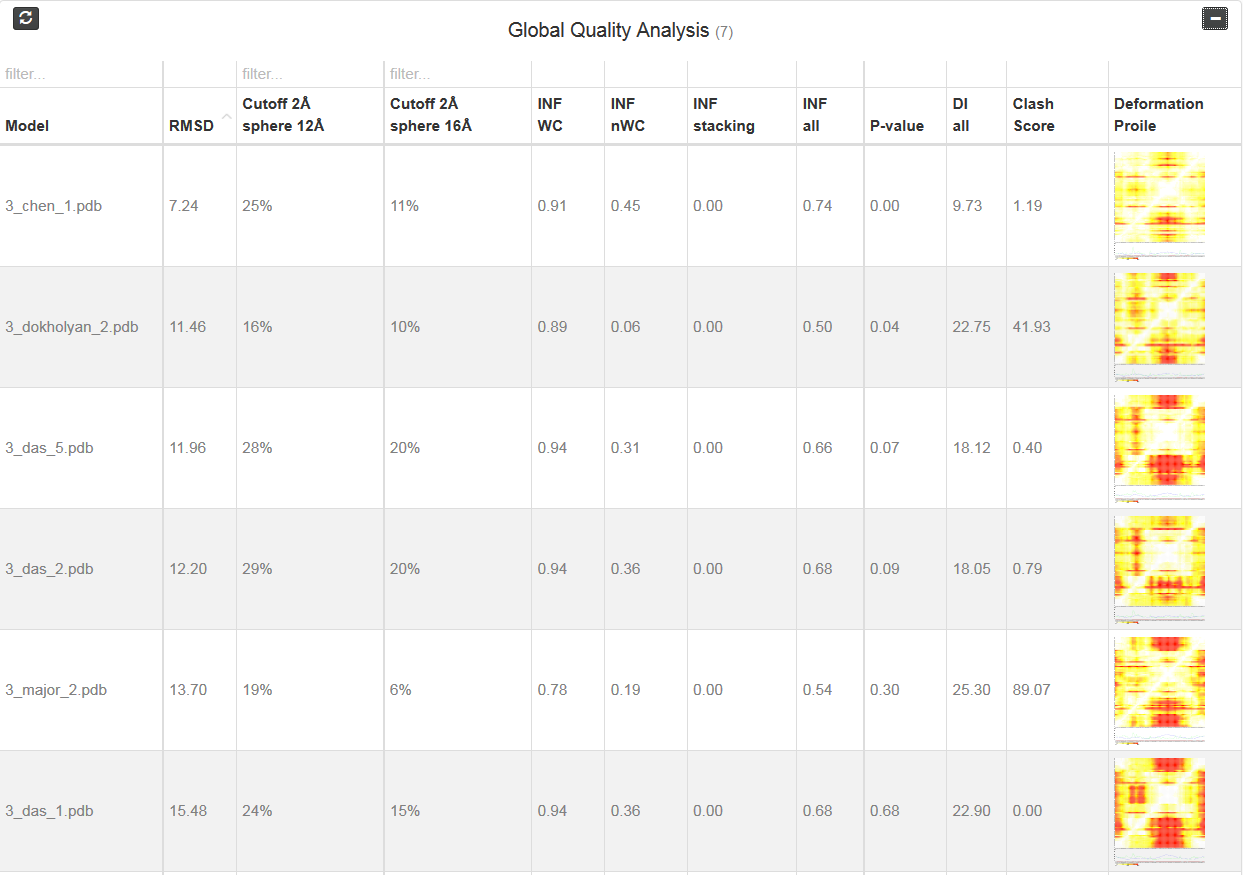
Fig. 3. Global Quality analysis results
Each column correspond to one metrics. Additionally, one can see two “cutoff” metrics - the calculation is performed based on the fixed precision value (cutoff threshold) for each sphere radius, defined by the user in the spheres radii vector; as a result, the user receives information about the percentage of nucleotides predicted with the quality below specified cutoff (%). Last column corresponds to the picture of Deformation profile (Parisien et al., 2009). By double click user can enlarge the picture and view results of the analysis.
Parisien M, Cruz JA, Westhof E, Major F. 2009. New metrics for comparing and assessing discrepancies between RNA 3D structures and models. RNA 15(10):1875-1885.
Ad b) Linear plots
That section consists of set of three type of plots: Averaged, cutoff and multimodel.
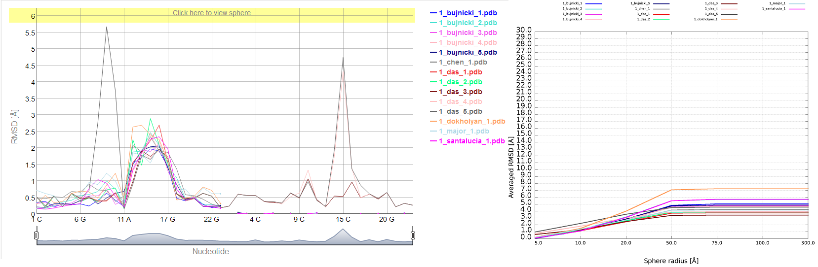
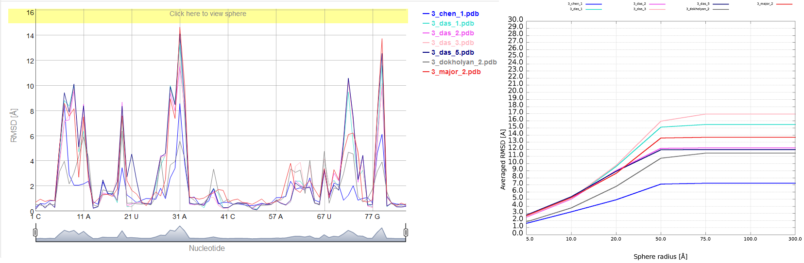
Averaged plot
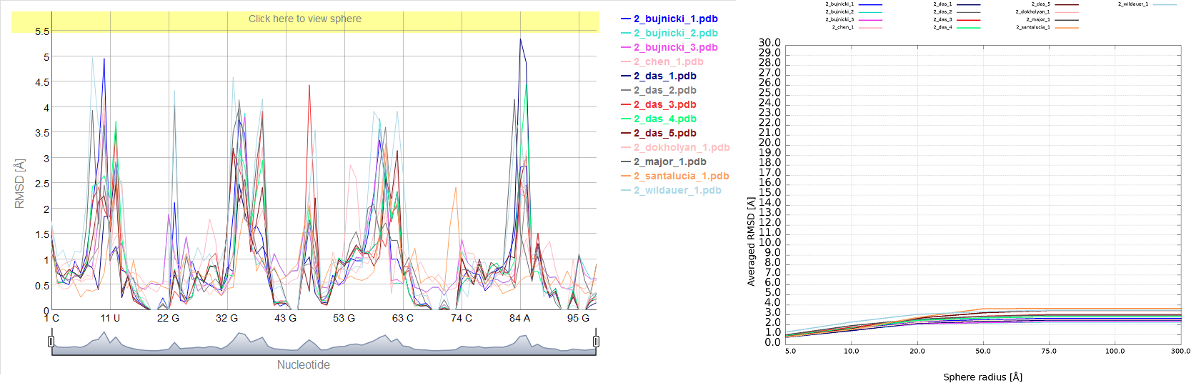
An example of averaged plot is shown in Fig. 4. This is also a multiple model line plot, where each line describes exactly one structural model (different colors correspond to different models). The difference between Multi-model plot and averaged plot is that in the latter case the Y-axis represents values of metric calculated as the averaged sum of value of spheres built with fixed radius for all nucleotides of the analyzed RNA molecule. This plot visualizes how averaged values change with an increasing sphere radius. In general, this plot describes the changes of quality of prediction from the local structural neighborhood to the whole molecule point of view.
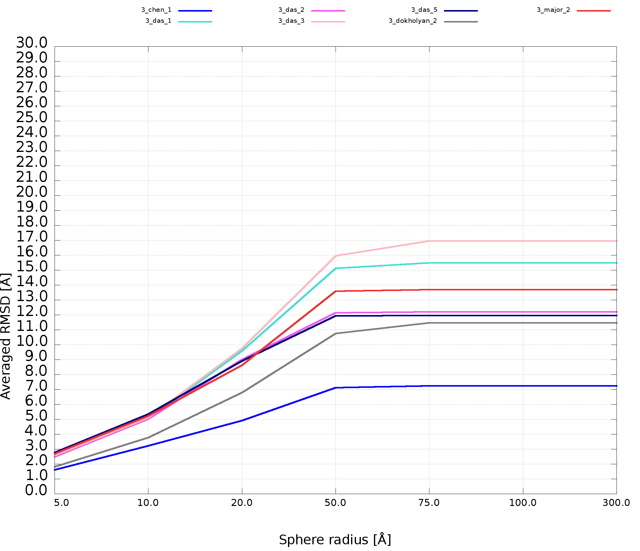
Fig. 4. Averaged plot; X-axis represents the sphere radius, Y-axis represents averaged valuefor all spheres with fixed radius (different colors correspond to different models).
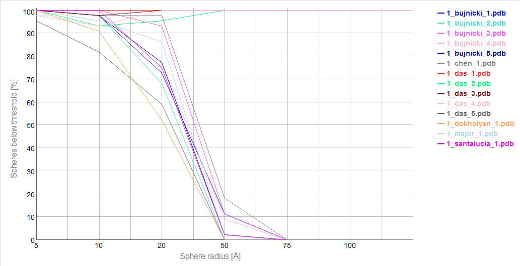
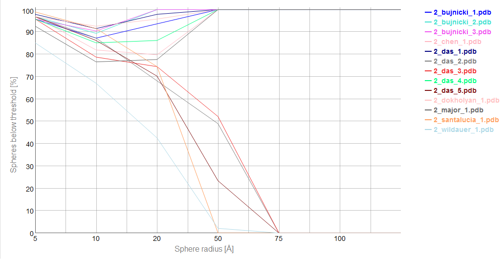
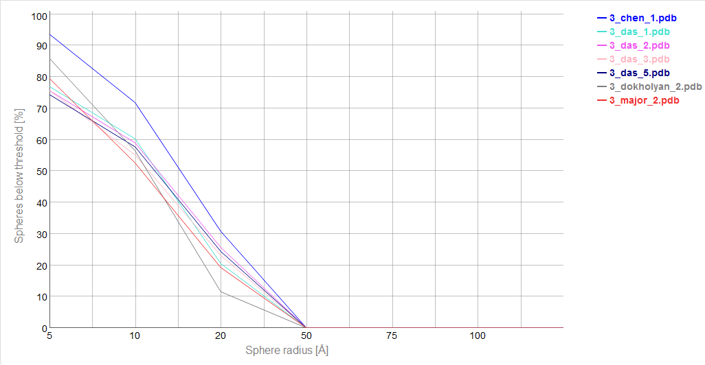
Cutoff plot
An example of a Cutoff plot is presented in Fig. 5. Cutoff plot shows how accurate is the prediction of a particular model from a local point of view or, in other words, which part of the model structure is predicted correctly. The calculation is performed based on the fixed precision value (cutoff) for each sphere radius value, defined by the user in spheres radii vector. As a result, the user receives information about the atoms set predicted below cutoff (%). The value of cutoff can be changed interactively by the user.
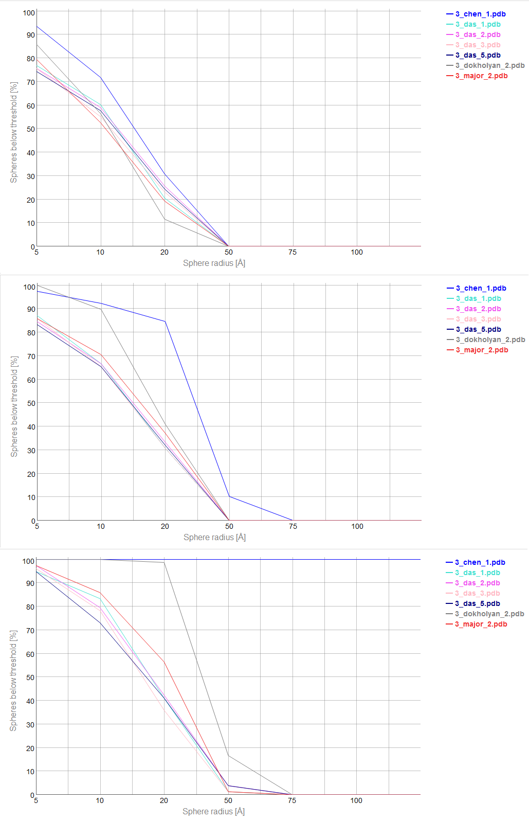
Fig. 5. Cutoff plot presents a percentage of the number of atoms sets included in spheres with fixed radius for each considered model, which are below a selected precision value. One line corresponds to one model. X-axis corresponds to sphere value, Y axis corresponds to percentage value. On the picture above one can see plots for precision values (from top to the bottom: 4 Å, 7 Å and 10 Å).
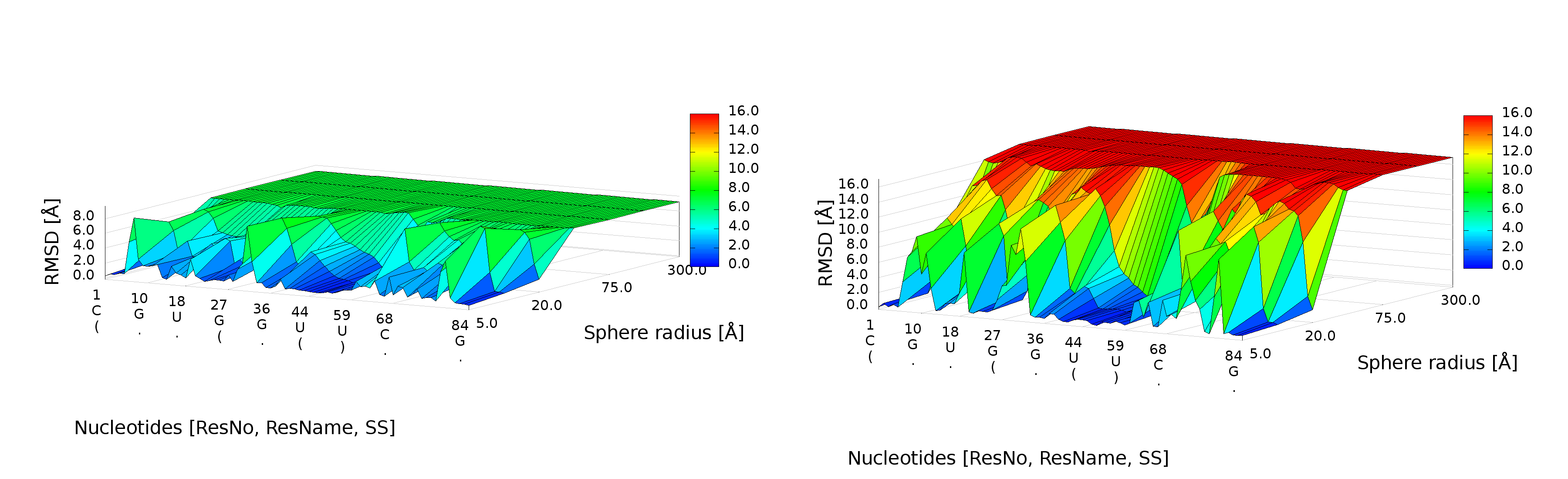
Multi-model plot
An example of Multi-model plot is presented in Fig. 6. This is a multiple model line plot, where each line describes a single model analyzed. Each model is shown in a different color. Metric values between atoms from the reference structure and corresponding atoms from the model analyzed are calculated for atoms included in the sphere, where the center of the sphere is a selected atom (predefined by the user). Spheres are built for every nucleotide in the considered reference structure.
The Multi-model plot visualizes how accurate is the prediction of atoms located in the neighborhood of every nucleotide, taking into consideration the sphere radius (each line describes exactly one structural model - different colors correspond to different models). With a low radius (small local neighborhood – high precision of assessment), the local quality of models analyzed is very good for almost all nucleotide residues in the model, because accurate modeling of chemical structures of nucleotide residues is relatively easy. With the increasing value of radius one can easily identify the parts of models that exhibit different accuracies of prediction, from low values that indicate correct predictions, to important structural errors (for example different torsion angles – high values for local neighborhood) that should be widely and carefully analyzed. If the radius increases to match the molecule radius (i.e. at the very low level of precision of assessment), Value for the sphere that contains all nucleotides levels off to the same value, equal to global for a particular model (Fig. 6E).
The main feature of the Multi-model plot is Y-axis scaling of all predicted models to the potentially worst model, because its values are the highest. Visualization of two prediction models that differ significantly (one model – very good quality of prediction, second model – significant structural errors) on the Multi-model plot can be confusing because the value for the worse model may dominate the visualization of errors for the model with a better accuracy. Hence, the user can analyze each model separately.
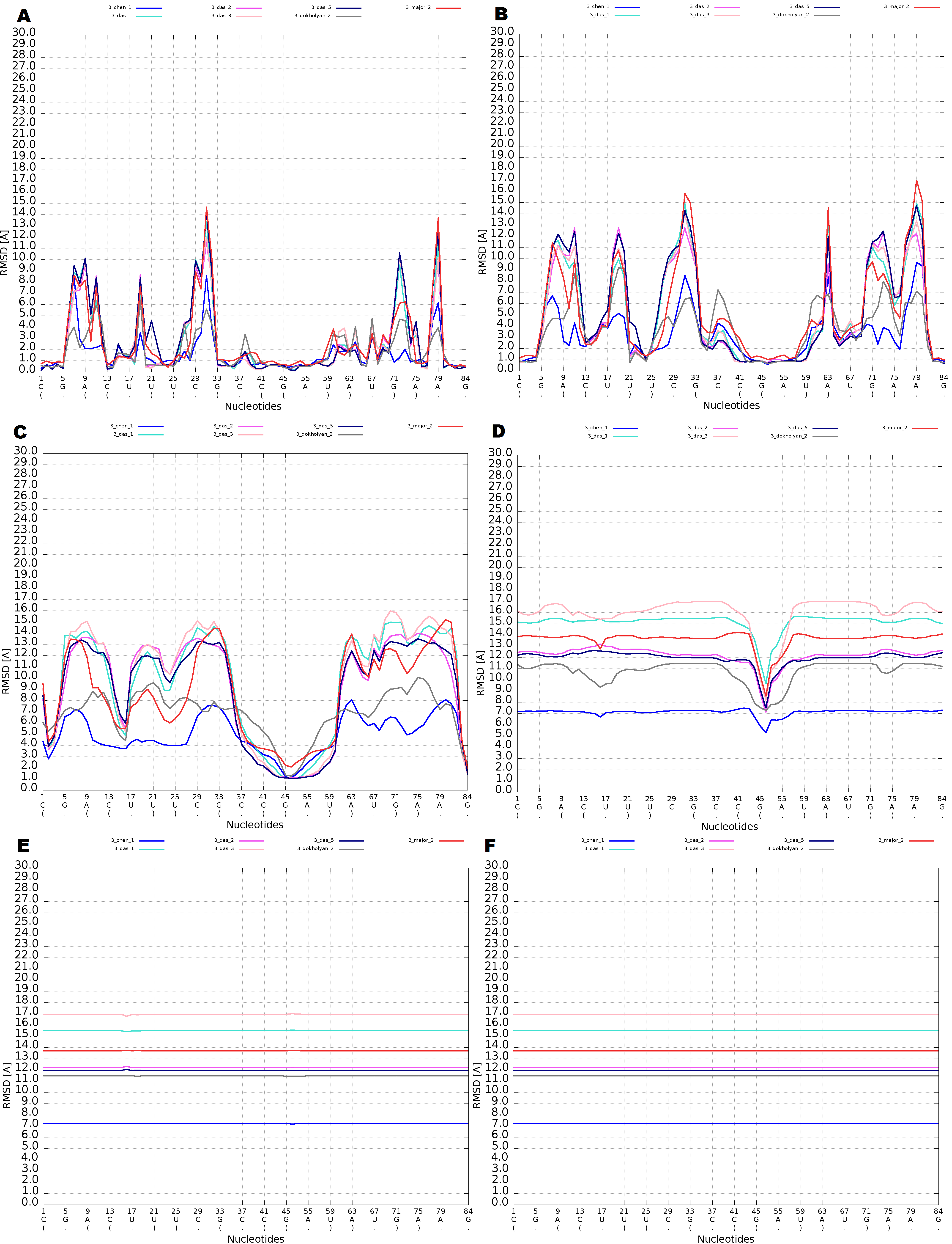
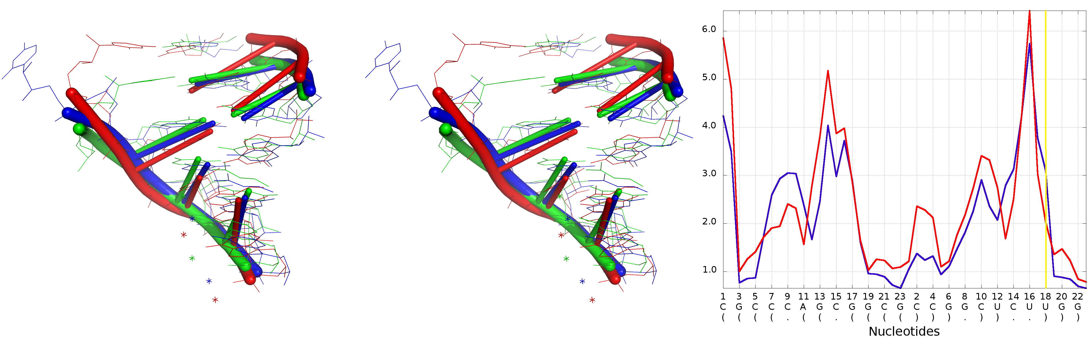
Fig. 6. Multi-model plot for Challenge_3 of RNApuzzless contest; each plot (A-E) represents results for a different sphere radius (5, 10, 20, 50, 75 and 100 Å). X-axis represents the order of nucleotides in the sequence, Y- axis represents the value of RMSD.
Interaction with plots
Multimodel and cutoff plot can be adjusted be the user by changing the value of the sphere radius using slider above the plot or by setting particular value in the window Fig. 7.
Range selector bellow plot area can be used to filter nucleotides for which values are shown.
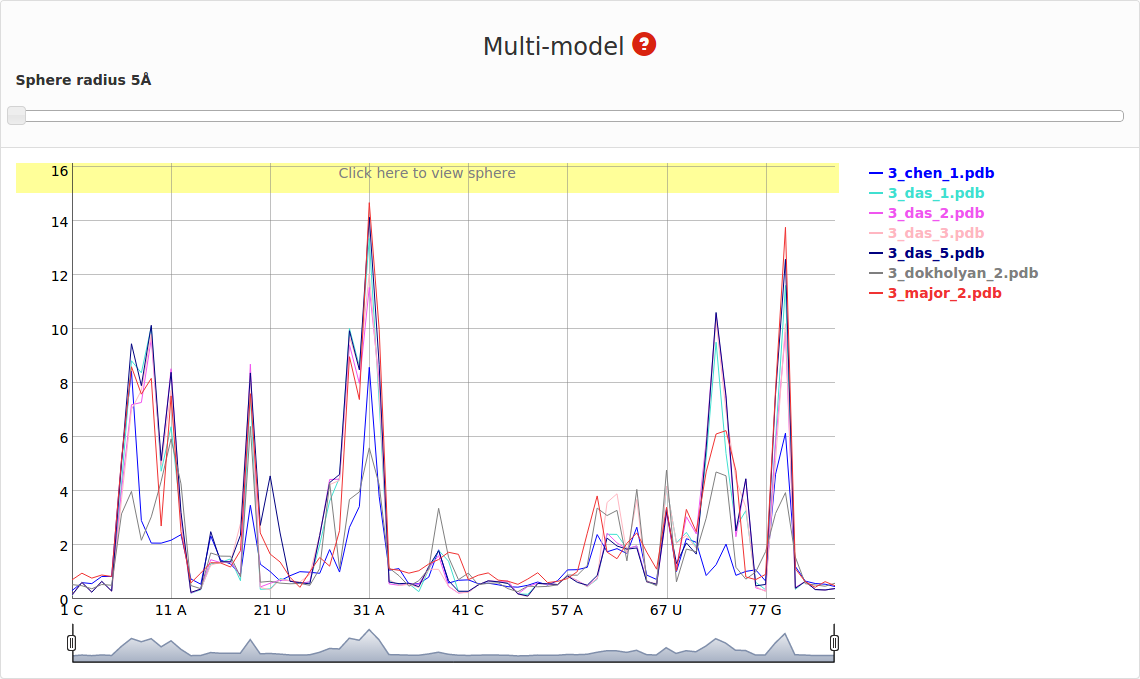
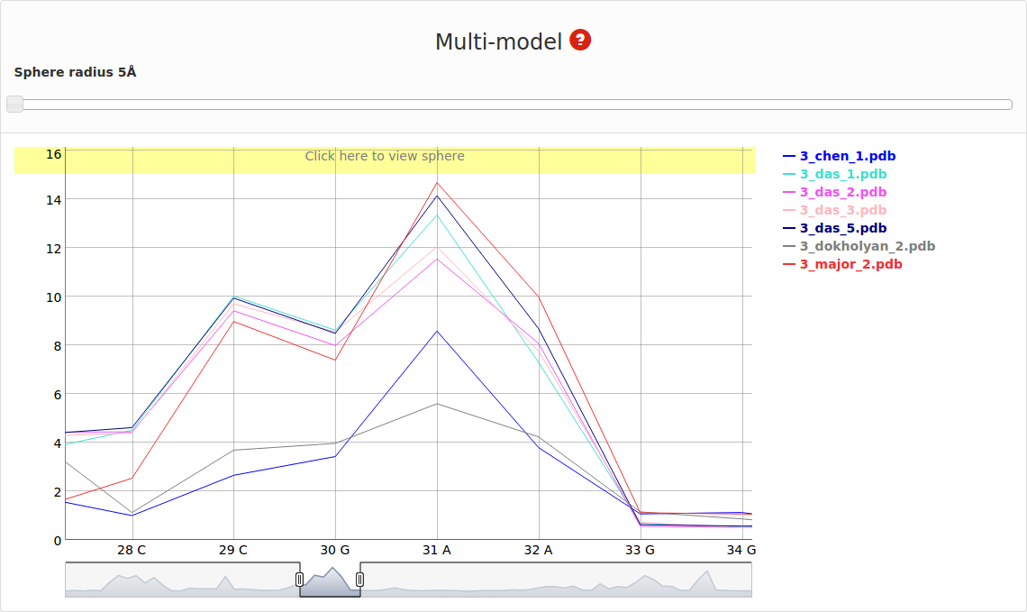
Fig. 7. Multimodel plot (interactive)
On the right side one can see the legend that corresponds to each model Fig. 8.
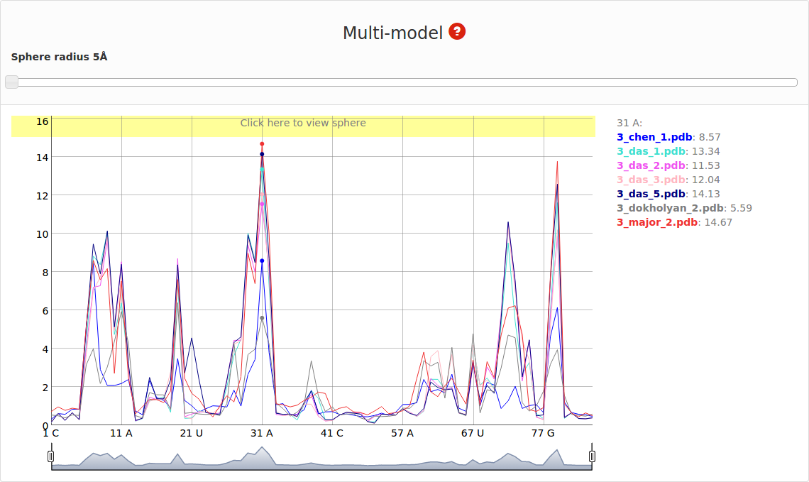
Fig. 8. Multimodel plot (interactive) – dots correspond to the analyzed nucleotide.
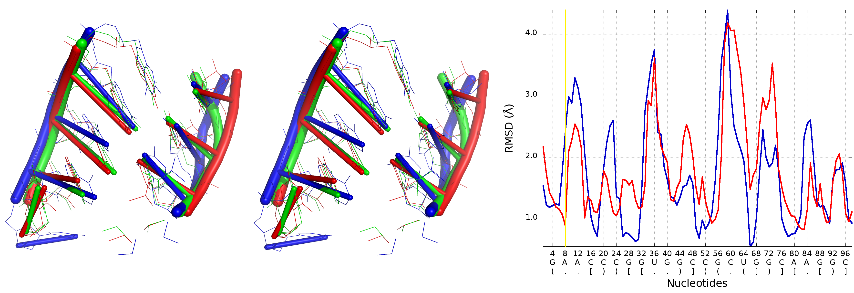
If mouse pointer will be placed on the graph, the corresponding values as well as position will be presented on the right side of the model name. If user uses left mouse button having mouse pointer on the yellow bar (top of the plot), the visualization of the spheres corresponding to analyzed models built on particular nucleotide will be presented using Jmol software (Fig. 9). Left panel consists of list of models as well as visualization mode. Playing with checkboxes one can set what models will be visualized (by default all models will be shown (Fig. 9. left). If all checkboxes are unselected, only reference structure will be presented (Fig. 9., right)). Visualization mode give a possibility to view presented structure as cartoon or full atoms molecule. User should realize that presented structure corresponds to the set of atoms that are situated inside particular sphere. Only if the radius of sphere is larger enough to cover whole structure, the full model will be presented.
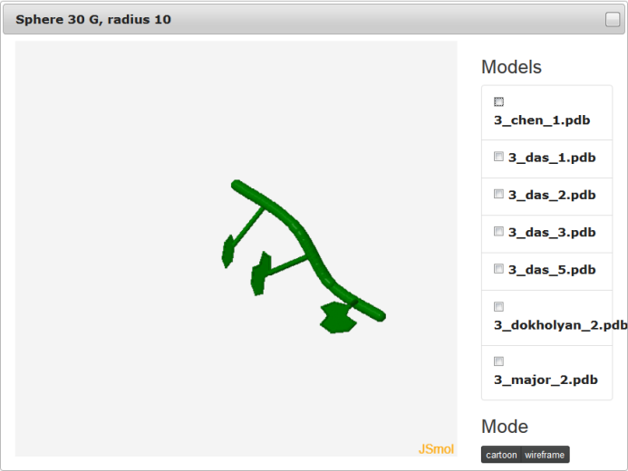
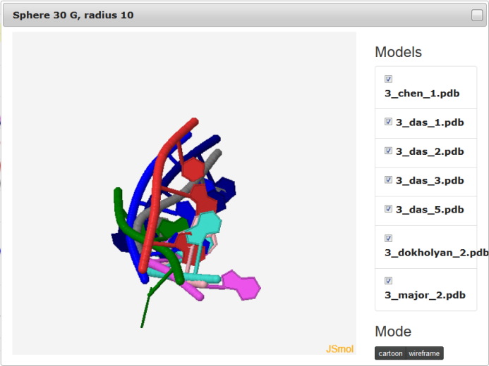
Fig. 9. Visualization of spheres with Jmol.
The feature to visualize analyzed structures using Jmol is available only for Multimodel interactive plot.
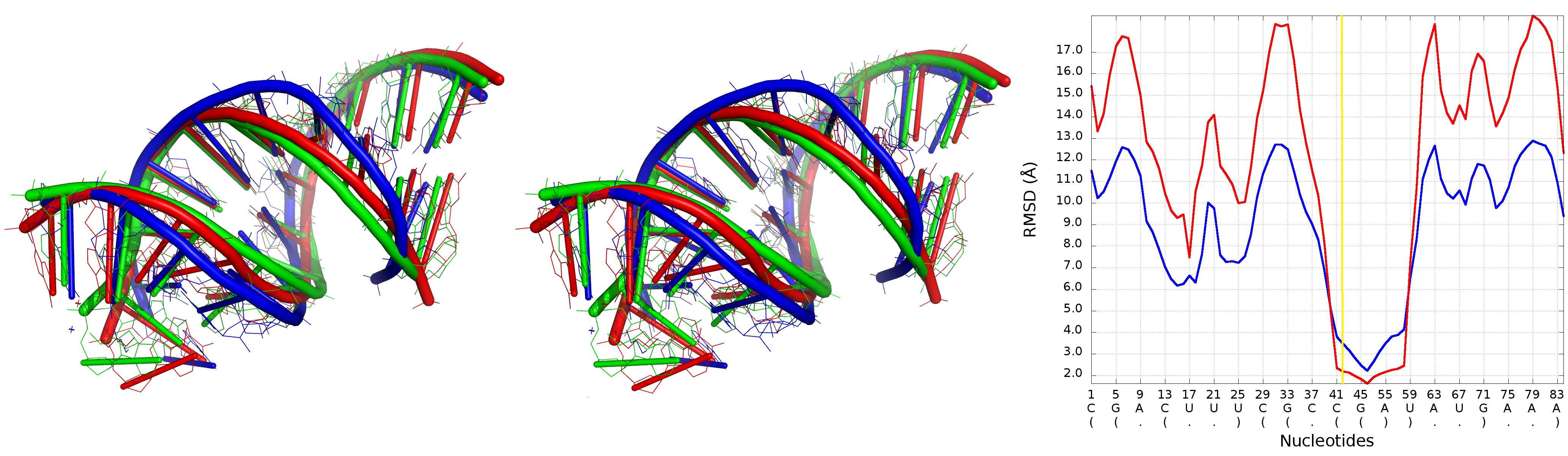
Ad c) 2D and 3D graph section
That section presents 2D map plot and 3D graph for each analyzed model. Each row corresponds to one model. The data are presented in the following order: model’s name, 2D map, 3D plot.
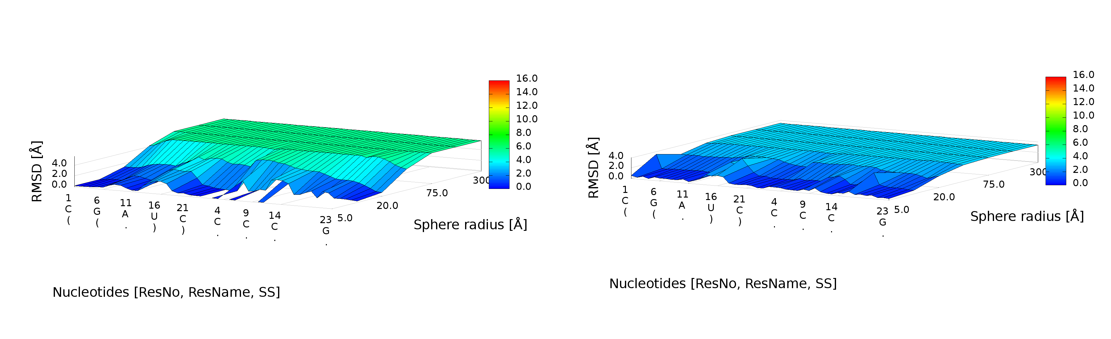
2D map plot
An example of a 2D map plot is presented in Fig. 10. This plot visualizes exactly one model at a time. The values are represented with a colored scale - values correspond to colors from blue (high prediction quality) to red (low prediction quality). The X-axis represents residue numbers (in sequential order), and the Y-axis represents the radius values from the spheres radii vector defined by the user. This plot shows where the prediction is inaccurate and allows the user to check if prediction errors are similar for different structures.
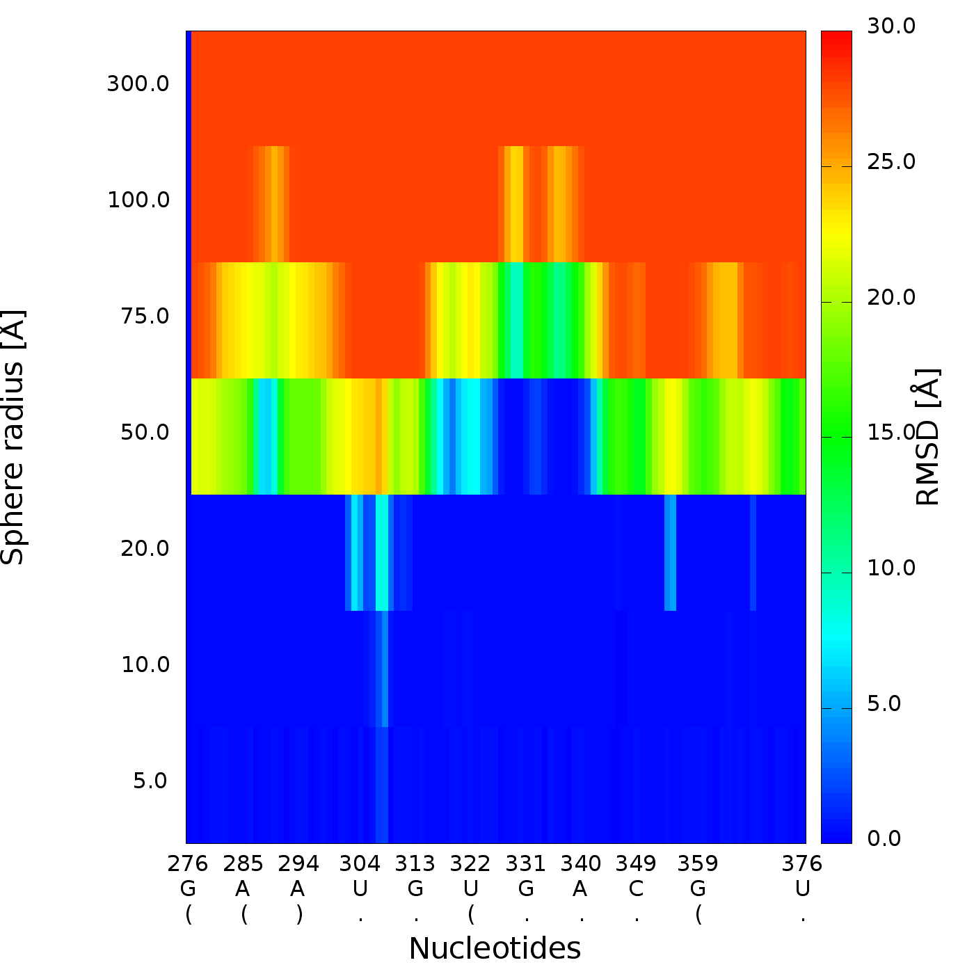
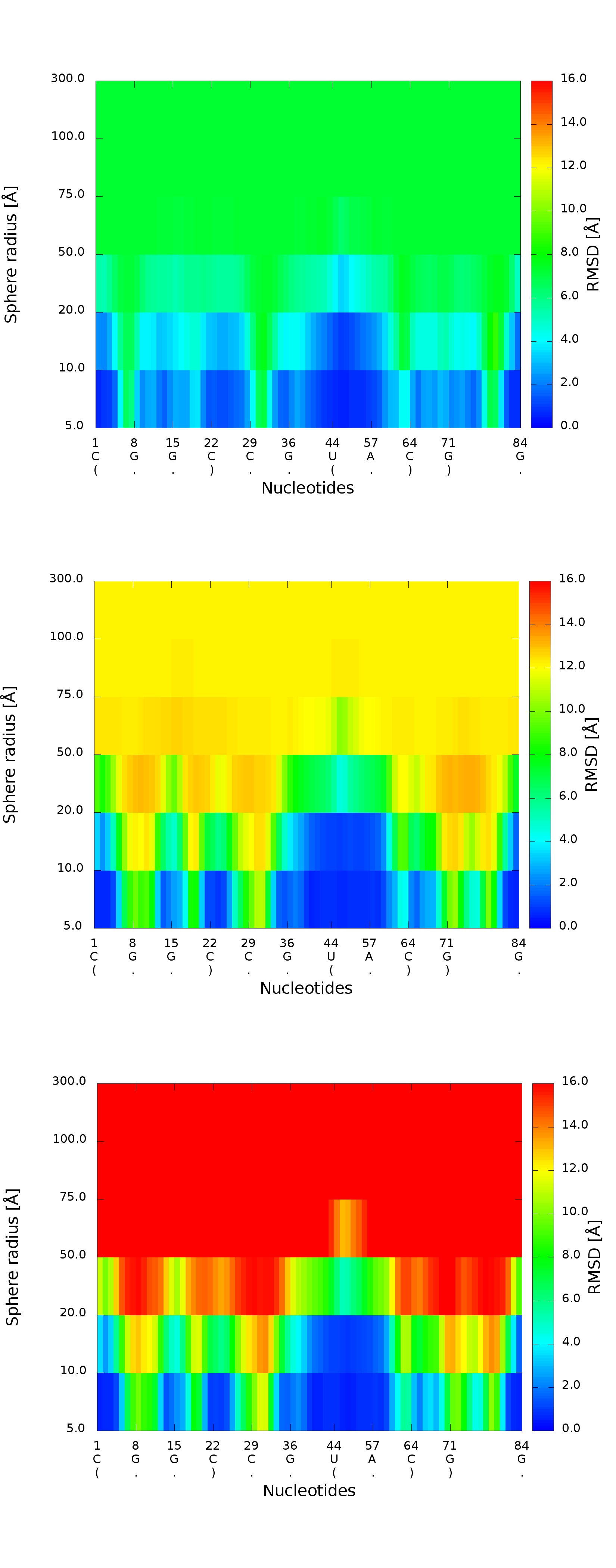
Fig. 10. 2D map plot - each map corresponds to one of the analyzed models; X-axis represents the order of nucleotides in the sequence, Y-axis represents the sphere radius, color of the cell represents the RMSD value, following the scale presented at the bottom (blue – low RMSD, red – high RMSD).
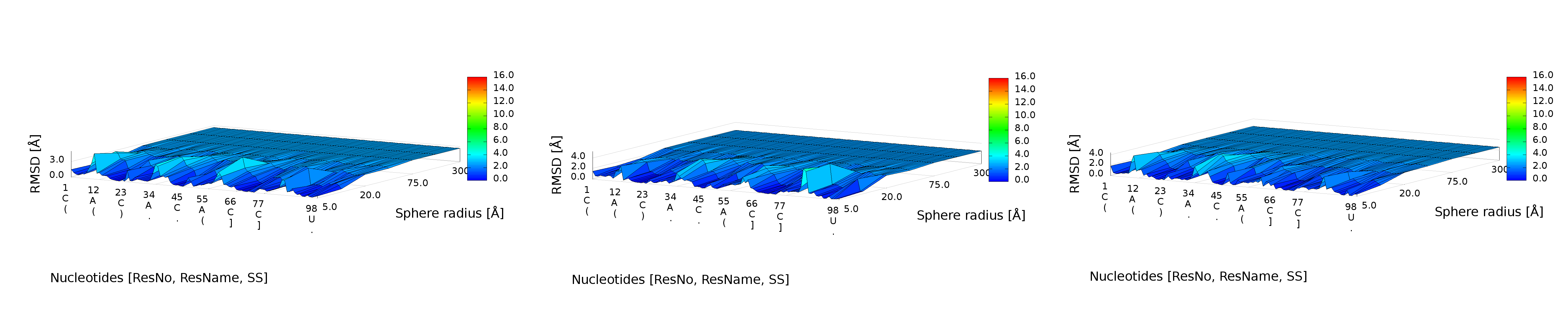
3D plot
An example of a 3D plot is presented in Figure 4. The X-axis represents nucleotide numbers in sequential order, the Z-axis represents the radius values from the spheres radii vector defined by the user, and the Y-axis represents RMSD. The value of RMSD is also represented with the colored scale. Both plots (2D map plot and 3D plot) describe the accuracy of fragments of a prediction model around certain nucleotides.
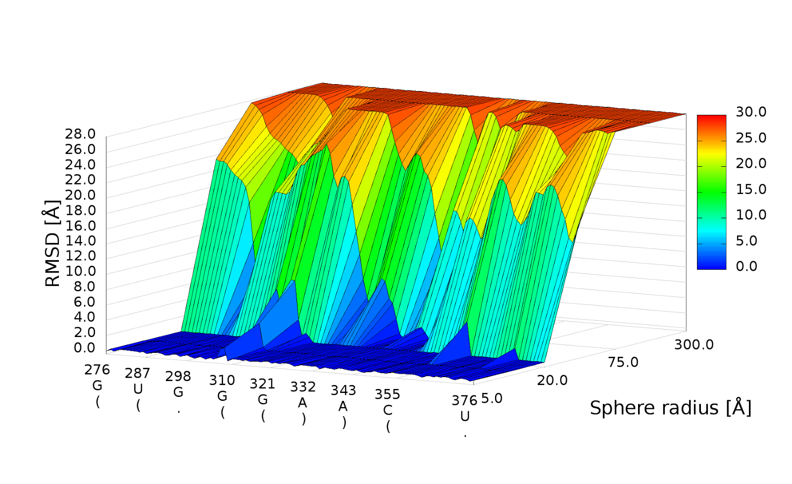
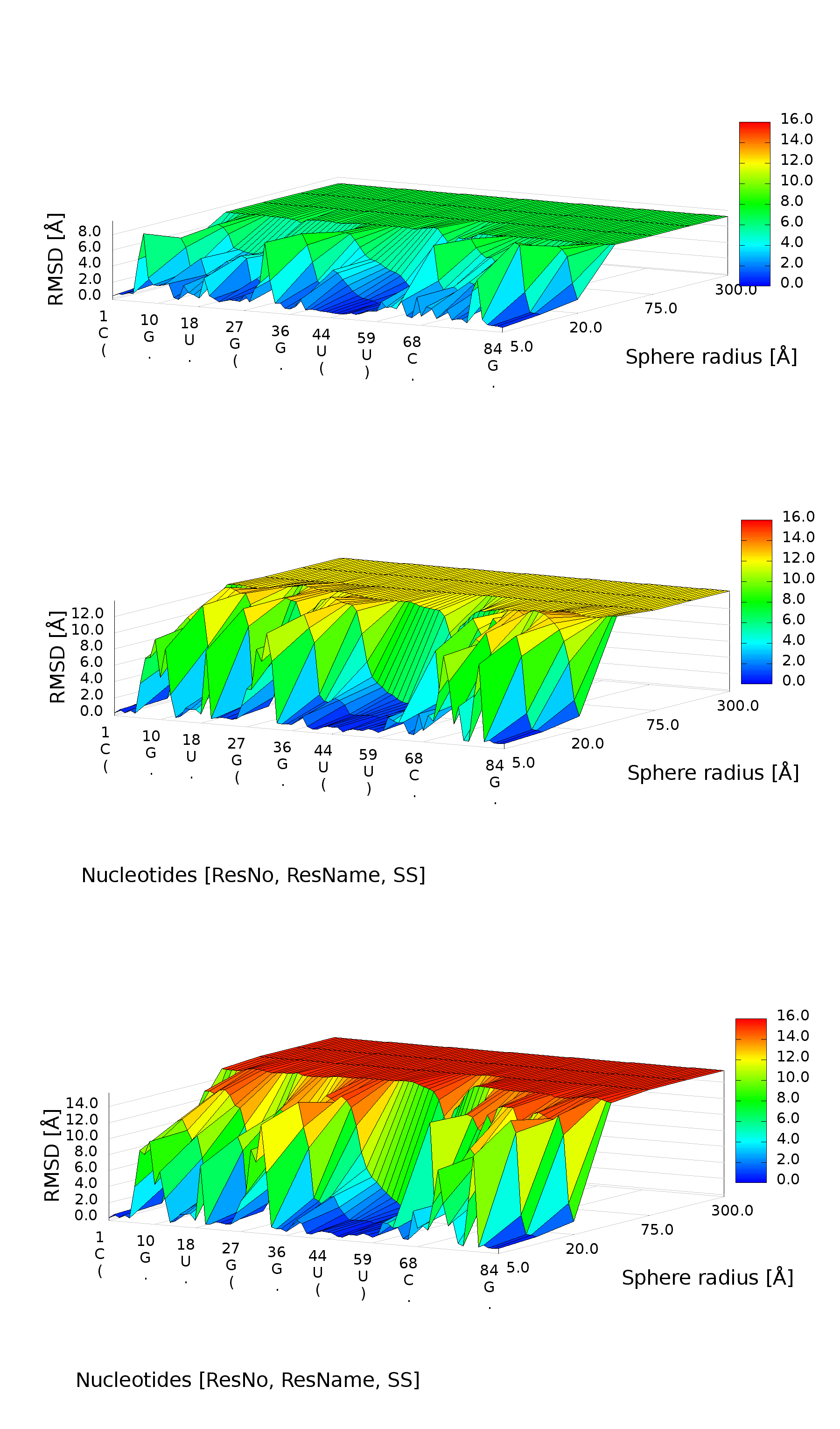
Fig. 11. 3D plot – analysis of three models; X-axis represents the order of nucleotides, Y-axis represents sphere radius, Z-axis represents RMSD.